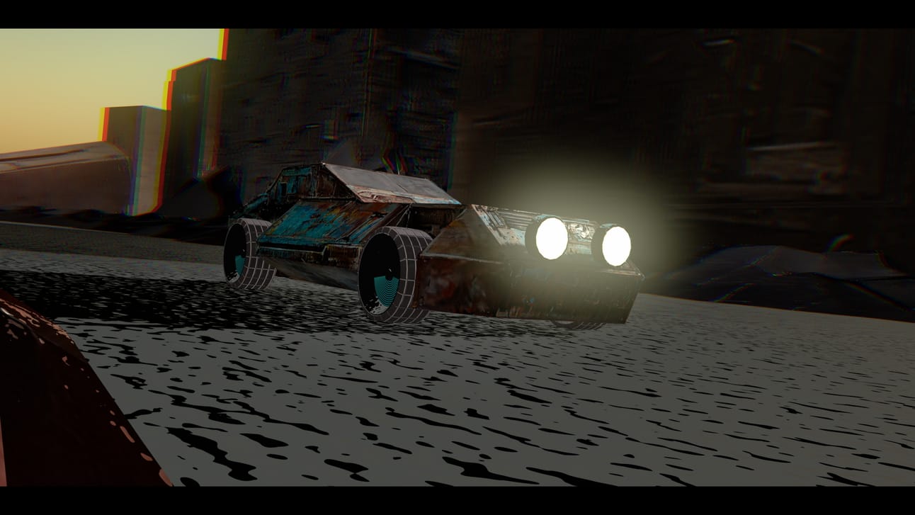
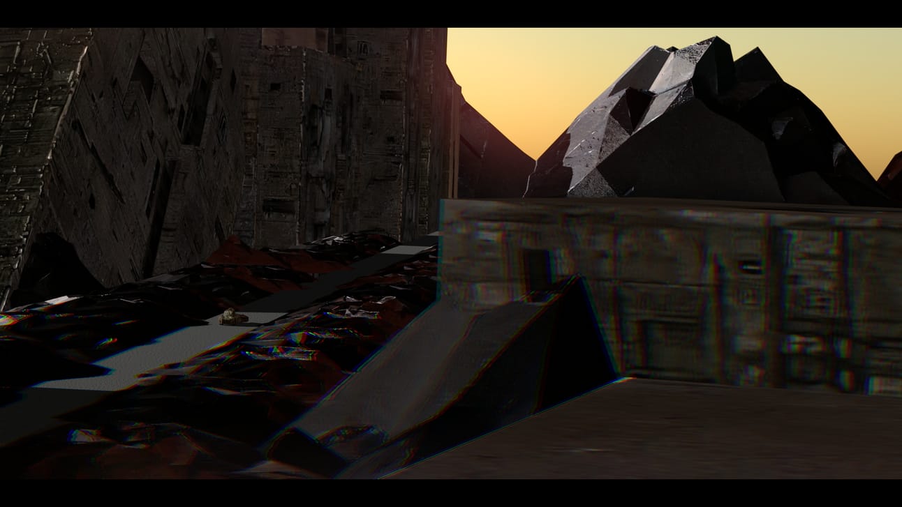
As you already know, my first animated short, ESCAPE, is available online. I started working on this short at the beginning of 2023.
How did I finish it within a year? What advice would I give to someone starting their first animation? After some reflecting, here’s my takeaway points:
Inspiration

I had many inspirations for my short, namely:
90s video game graphics
Several car combat video games like Need for Speed: Hot Pursuit, Planet of Death, Burnout, and Motorstorm.
Disaster movie scenes from Mad Max, Dante’s Peak, Twister, and Hidalgo.
To steal ideas from one person is plagiarism; to steal from many is research.
The quote above is originally in a comedic context. In a digital art world of kit-bashing, photo-bashing, and asset sharing, “stealing from many” is almost expected. But having more inspirations helped me in a few ways:
Prevented me from focusing on one reference and copying one-to-one.
Diluted the references’ different styles, both in my final work and in my own mind, making it easier for my own style to come out.
Grounded me with more examples of effective storytelling.
All this only prevents or otherwise limits copying other styles and stories one-to-one, not growing my own. Which leads me to:
Consistent creative decisions
Every prop, camera angle, musical swell, must match the mood and theme. Like I said above, I used my inspirations as references for these:
For a retro video game style, I used simple lighting, low poly models, and my own form of cel shading.
To have a dramatic mood similar to cinematic game trailers, I used a wide aspect ratio, a tight edit, and heavy-hitting music.
For a grounded theme with a sense of stakes and realism, I added a dispatcher call and a volcanic disaster.

It was tiring to decide every detail of the animation. But that consistency pays off in the end. Viewers can sense it, especially when it falters.
I will be the first to admit Escape isn’t always consistent. But as I edited and re-rendered it to be so, I could see and hear the difference.
Approval, from concept to details
A color grade and visual effects will only do so much to fix a bad script.
Some artists wait to add color to their artworks until they’re satisfied with it in black and white. If it’s readable and interesting then, color will only enhance it.
Good ideas only get better with implementation. Bad ideas cannot be fixed or last long no matter the implementation.

So, I didn’t finish any phase of ESCAPE until I felt satisfied with the current result. It took a while to get to the fun stuff, but having a solid foundation made the final result more satisfying.
Letting art stand on its own
ESCAPE was a challenging project - one of the longest I’ve ever done.

As proud as I am of it now, it wasn’t easy to accept its shortcomings. It was difficult to publish something I knew wasn’t perfect. Sometimes, even while working on it, I wasn’t proud of it.
You may not be proud of your work-in-progress for a little while. And that’s okay. And despite seeing the imperfections, I was able to be proud of it.
Because as I gave ESCAPE what it needed to be consistent to its own style and message, it could stand on its own. Perhaps feebly, maybe with a limp. But once it could stand, it was able to let go of me, and I it.
Because art isn’t just what you want to put on the canvas, but what you enable the canvas to become.
What would you like your art to become?

